
Introduction
Maternal mortality, and its racial divides, is a pressing issue in the United States. To elaborate, the maternal mortality rate (MMR), which measures the number of deaths women face associated with childbirth per 100,000 live births, is significantly higher in the United States than other high-income countries, and the rates of maternal mortality in the United States are only getting worse. In addition, there is a wide disparity between the maternal mortalities of white and non-white populations in the United States. Furthermore, while states have implemented various policies aiming to reduce maternal mortality, it is not always clear which policies are important and effective. Now is a crucial time for people working to ameliorate this crisis. It is vital for women’s health activists and obstetrics medical specialists to see the impact of the crisis and how different factors might affect maternal outcomes. We hope this data can also be helpful for expectant mothers and people who have the ability to set policy or recommendations, such as the CDC or policy makers, in order to address the issues.
Global Comparison
Based on GDP per capita, the United States is one of the richest countries in the world. Despite this, its rates of maternal mortality are significantly worse than other rich nations. Out of the top 10 richest countries based on GDP per capita, the United States not only has the highest maternal mortality rate by a significant factor, but it is also the only one of these nations to have a consistently increasing maternal mortality rate from 2000 to 2020. As the other 9 richest countries steadily decrease their maternal mortality rates, the United States steadily increases it.

When looking at the percent change in maternal mortality rate from 2000 to 2020 for the top 10 richest countries, we see that the United States is the only country that has an increase in maternal mortality rate from 2000 to 2020. These countries are sorted in decreasing order of GDP per capita. This indicates that countries with both higher and lower GDP per capita have significantly larger maternal mortality decreases than the United States.

From 2000 to 2020, most countries reported lower maternal mortality rates. Across all income levels, the vast majority of countries in each income level decreased their rate of maternal mortality. An outlier to this trend, however, is the United States, as it is one of the few countries that had an increase in maternal mortality rate from 2000 to 2020, with an increase of 77.9%.

The United States stands out yet again when observing the relationship of maternal mortality rate and GDP per capita over time for the top 10 richest countries. For every country except the United States, we see either a consistent decrease or a slight increase in maternal mortality rate over time. This trend can be observed in both times of economic rise and fall.
Countries like Ireland and Singapore have a steady decrease in maternal mortality rates as their GDP per capita rises. As seen with the “reversing” line in Australia, Norway, and Qatar, maternal mortality rates continue to decline despite the decrease in GDP per capita. The United States, on the other hand, constantly has an increase in both maternal mortality rate and GDP per capita in each time frame. Additionally, the pace at which the maternal mortality rate is increasing appears to be worsening over time.

Zooming in on the U.S.
Let's go deep into the U.S., taking a look at the total MMR per 100,000 live births in each state. From the figure below we can see that the darker the color, the higher value of MMR in that state. The states in the South tend to have higher values for MMR, such as Arkansas, Louisiana, Georgia, and so on. Among all the states, Georgia has the highest MMR, which is 28.01 per 100,000 live births.

If we divide the states into four regions, in addition to the difference between each region, we can see the outliers in each region. For example, in the Northeast, most states have MMR between 9 and 15, but the MMR of New Jersey is 23.58, which is much higher than its neighboring states. On the other hand, the MMR of Massachusetts is only 5.39, which is much lower than its neighboring states. Let's go to the South region, though District of Columbia has the highest MMR, it is a district rather than a state, so if we ignore it, Georgia would have the highest MMR at 28.01. In the later part, we will further explore the MMR in Georgia.

Racial Differences in the U.S.
Taking a look at the maternal mortality in the United States by race, a clear difference immediately emerges for those who are Black or African American. A smaller, but still prominent, difference also appears for those who are Hispanic or Latino. These racial differences are especially prominent in the South, but these differences can be seen in states of all regions across the United States.

When looking at the percentage of births made up by each race, and the percentage of maternal deaths made up by each race, we see these differences again. On the right we have the racial breakdown of births, and on the left we have the racial breakdown of maternal deaths. Despite only making up 14% of the births, Black or African Americans make up 36% of maternal deaths.

Zooming in on Georgia

* tooltips indicate that the true maternal mortality rate is likely higher
In every Georgia region with available data, the Black maternal mortality rate is many times higher than the white rate. Additionally, the maternal mortality rate for both Black and white Georgians is higher than the national average from the same years in almost every region. In East Central GA, the maternal mortality rate for Black mothers is more than 4 times that of white mothers.

Not only is the maternal mortality rate higher for Black than it is for white Georgians, in many regions, even the number of maternal mortalities is higher.

The Effect (or lack thereof) of Policy
Since maternal mortality is such a salient problem, especially in the United States, what is being done to address it? Various states have implemented different types of policies, which can be thought of in terms of three categories: Coverage and Benefits such as telehealth benefits and postpartum coverage; Care Delivery Transformation such as provider bias training and changes to policies regarding payments; and Data and Oversight which relates to regulatory councils and data collection. However, how much of an effect do these policies have?

There is a slight negative correlation between the number of policy types enacted to combat maternal mortality and the actual rate of maternal mortality in that state, however, that effect is much weaker than many would expect it to be. Also, it does not carry over to the Northeast region. The negative trend might mean that the policies are helping, or it could be a more confounding relationship related to underlying factors that make a state both more likely to adopt such policies and to have better maternal outcomes. However, the weakness of the correlation means that these policies don't all have a clear and effective impact, or at least not in all cases. There also don’t seem to be strong regional trends or groupings.

This holds only for Coverage and Benefits when breaking down the policies into their three main types. Care Delivery Transformation and Data and do not have regionally consistent negative impacts on MMR. Care Delivery Transformation is the most negatively correlated out of the categories (meaning it has the most impact on reducing mortality), but all of them are quite weakly correlated.
Next, let's see if there are geographical patterns to policies that might offer some insight.
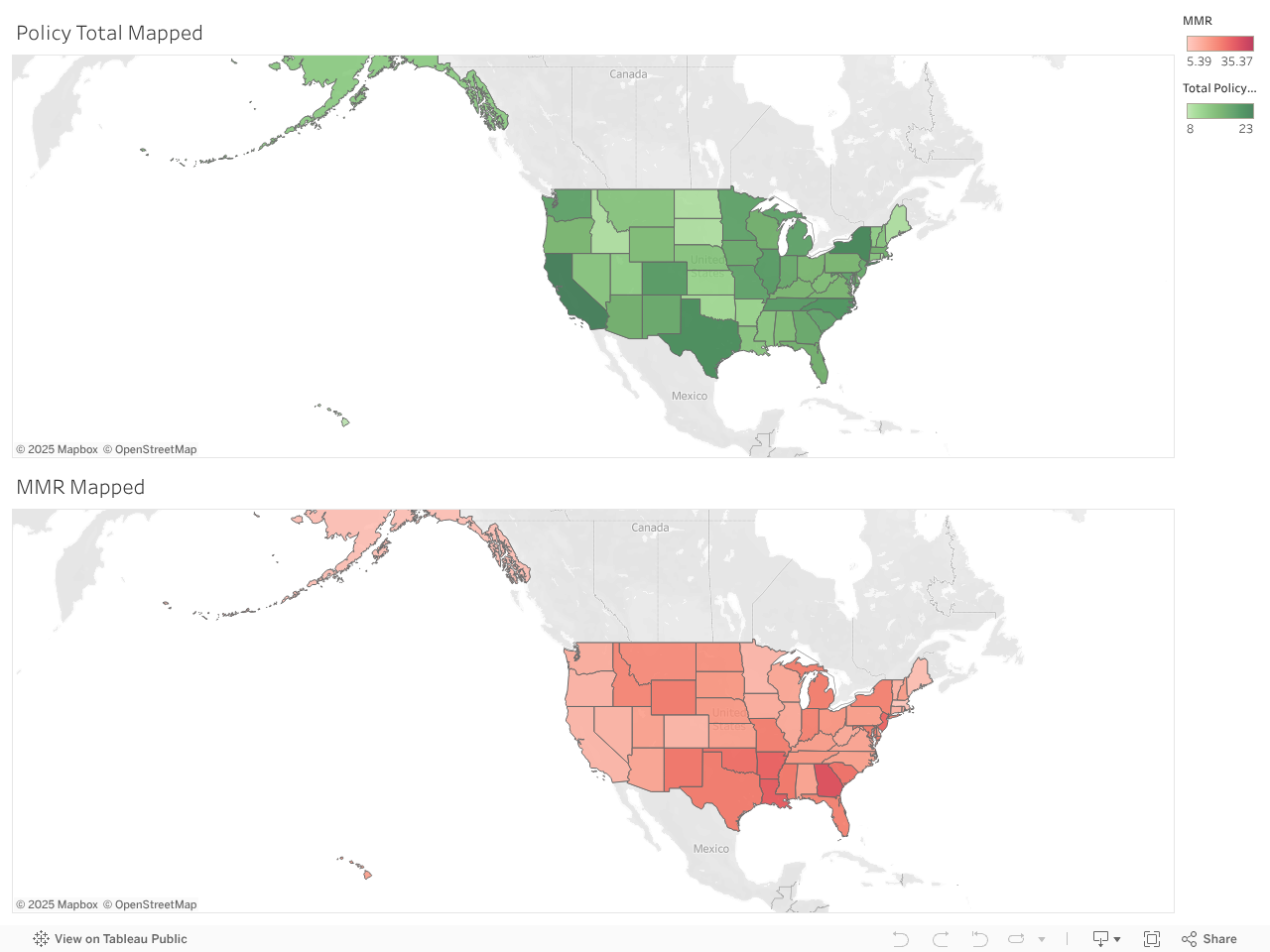
When looking at maps to try to see regional patterns, we can see that the number of policies is less in the more central states, but it doesn’t have a clearly political geographic divide, which was surprising.
Now we can go into some deeper analysis and exploration of how the additions of policies impacts MMR at the state level over time: both in general and relative to the wider context of the US average MMR. On the top the map shows MMR (in deaths per 100,000), while below it shows how each state compares to the context of national average mortality for that year, so green states have MMR below the national average, and in the states colored red, there are more deaths than the national average. You can also explore policies for a given state using the timeline, to help track that state's performance over time.
Note: a wide window size is required to read these maps as intended. The bars on each state represent how many policies of each type the state has implemented, cumulatively, up to and including the selected year, with purple for Care Delivery Transformation, blue for Coverage and Benefits, and brown for Data and Oversight.
The bars show how many policies in each policy category have been cumulatively implemented in each state up to the chosen year.

In order to evaluate the impact of a policy and drive change, we will look at the policy and how its implementation coincides with trends in MMR. Since the US has unfortunately had increases in MMR overall in recent years, it’s important to consider not only the impact on MMR but also how that MMR looks in the context of national trends. So, the lower line chart here considers MMR scaled by the national average MMR each year, and a decrease in that metric signifies that the state is performing better than expected for the US in general compared to how is used to be performing, but the MMR may not be decreasing in absolute terms. The year relative to the policy change is negative for before the policy was implemented, and positive afterwards.

So, for example, both metrics show us that substance abuse support policies seem to help with MMR, while Blended Payment Rates don’t seem to have an impact. However, for Presumptive Eligibility policies, it’s when you compare it to the national rates that it seems most beneficial for MMR.
Feel free to explore the different policy types, and we hope you can use the insights here to spur further research, activism, and outreach to help address the US’s growing problem with maternal mortality.

Data Sources Used
- https://ghdx.healthdata.org/record/ihme-data/united-states-maternal-mortality-by-state-race-ethnicity-1999-2019
- https://www.cdc.gov/nchs/data/hestat/maternal-mortality/2021/maternal-mortality-rates-2021.pdf
- https://www.cdc.gov/nchs/maternal-mortality/MMR-2018-2021-State-Data.pdf
- https://data.hrsa.gov/topics/health-workforce/ahrf
- https://data.unicef.org/resources/trends-in-maternal-mortality-2000-to-2020/
- https://wonder.cdc.gov/natality.html
- https://wonder.cdc.gov/cmf-icd10.html
